They told me my voice was going to be squeaky and out of control for a while, but after that people would stop mistaking me for my mother on the phone. I was okay with that.
Later, they told me that being a dad would turn me from an autonomous being into a full-time unpaid chauffeur. I was okay with that, too. (There are compensating factors.)
But nobody told me about bifocals. I’m not so okay with bifocals.
Life is a series of transitions. No matter your starting place or the paths you take, transitions are inescapable, like them or not.
Keeping in mind that everyone is facing transitions will help you always deal more successfully with people. Better yet, when you understand what others are going through you can communicate more clearly and compassionately.
Which brings me back to bifocals.
Bifocals are inevitable once you reach a “certain age.” For most of us, that’s somewhere around forty. Almost every pair of human eyes eventually develops presbyopia. (I think that’s Greek for “Your eyes don’t work like they used to.”)
The older you are, the more severe your presbyopia. Above age sixty, virtually everyone has (or should have) bifocals.
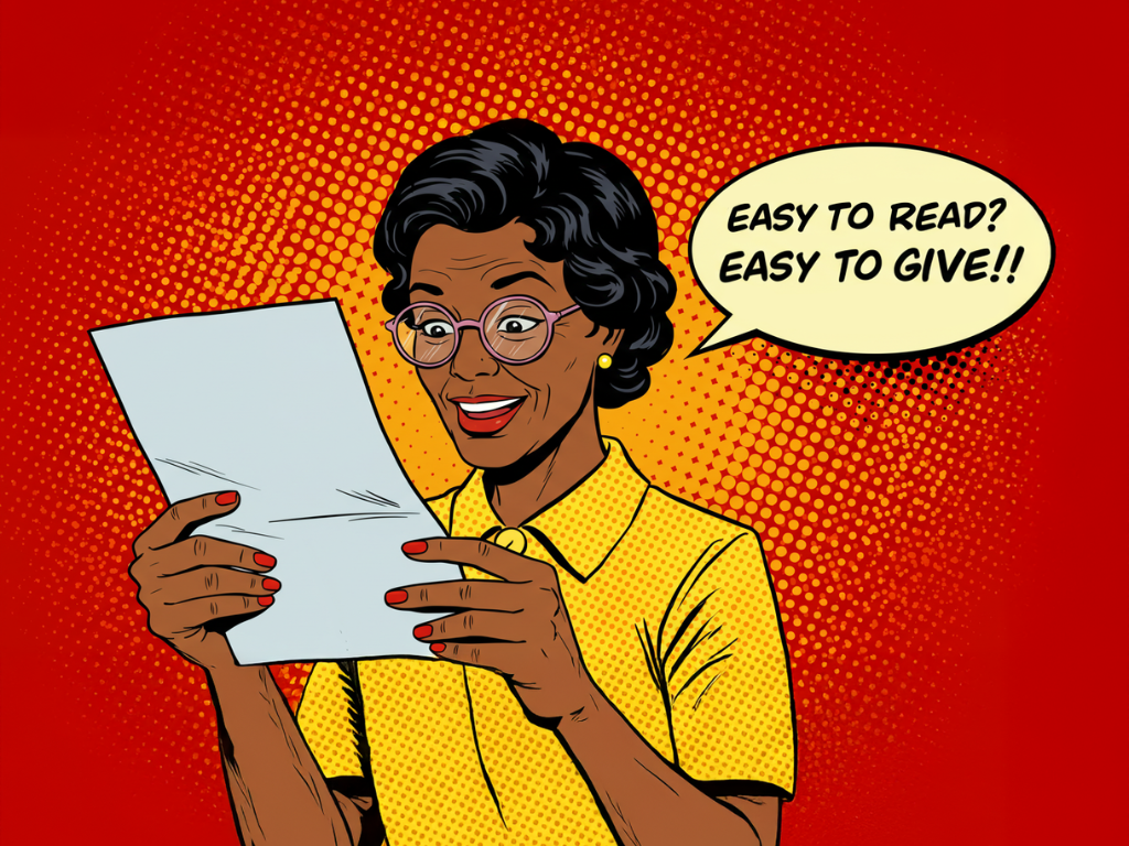
Which means . . . your donors wear bifocals.
If you haven’t crossed the bifocals transition yet, let me tell you about them. They’re okay most of the time. But reading is a challenge. You push the glasses up and down your nose. You crane your neck and tilt your head side to side, seeking the spot where you can see most clearly. You angle the paper to try and catch as much light as possible. Sometimes you just give up.
As a member of the presbyopic community, I have a proclamation:
Life is too short (as bifocals remind us) to spend a lot of time trying to read something that may or may not be of any value or interest.
So be kind to your donors. All it takes is to design with presbyopia in mind. Be kind to them, and they’ll be more likely to give to you. (Really. It’s been tested. It works!)
Here are design tips for keeping your fundraising readable and effective:
Keep text big
If you want people to read something you’ve written, don’t used any size under 12 point! And 12 point should be the smallest size you use: 13-point, 14 point, and even bigger are better yet.
Those larger sizes may look odd to you. Almost like you’re shouting in print. But to your bifocal-wearing donors, it’s a breath of fresh air – something they can read without a struggle! Wouldn’t you rather be a source of joy and ease for the good people who support you, instead of part of the daily battle to read?
They may not recognize exactly what it is about your materials that they like, but your fundraising will do better if you make it easy for them.
Font choices
In general: Use serif font in print and sans-serif font for screens.
That’s the way to make sure your material is readable. It’s a bit of an over-simplification, but it’s a good place to start.
There are some good sans-serif fonts (Verdana is one of them) that can be readable (at larger sizes) in print. The fonts you really should avoid are those with spiderweb-thin lines. Also, with screen resolutions getting better all the time, it’s likely that the need to avoid serif fonts online is fading away.
Black type over a white background
If you want people to be able to read what you’ve written, you really have no other choice than the “standard” approach. All those slick, cool, modern approaches … they seriously impede readability:
- Don’t use reverse type (light type over dark background).
- Don’t put type over images.
- Don’t put type over any but the very lightest of tints.
- Don’t use type colors other than black.
- Don’t use ALL CAPITAL LETTERS (it’s significantly harder to read).
You can use some of these approaches for very large type and not many words. Like headlines.
Line length
A line of type (number of characters in a single line left to right) should be no more than 65 characters. Beyond that, reading becomes more difficult.
White space
White space – space with no type in it – is the reader’s best friend. Leave ample margins between type and the page (top, bottom, and both sides). Insert a blank line between paragraphs (unlike in books), and keep paragraphs short. (For direct mail, I rarely allow paragraphs to be more than six lines long.)
Glossy paper
Glossy paper can be great for vibrant colors. But it’s especially hard for those with less visual acuity. The reflections really make it hard for people to see the text.
Some of these things may make designers (especially young ones) unhappy. They might like striking and modern looks. That has a place, but not in fundraising. Remember these two principles:
- If something is hard to read, fewer people will read it. And if fewer read, fewer will respond. This is confirmed by testing.
- Design that’s hard to read is rude. It’s the equivalent of mumbling when you talk.
Would you like a graduate level course in great fundraising design? Read Creative Deviations by John Lepp. It’s a favorite in the Moceanic community!
There’s a powerful fundraising tool that builds meaningful relationships with donors, helps you find the hidden gold in your file, and immediately boosts revenue. Have you tried our unique Donor Survey? It’s easier than you think! Find out more from our e-guide, 5 Easy Steps to Your Game-Changing Donor Survey. Free!
Related Blog Posts:
- What You Wish You Knew about Fundraising Design [Book Review]
- What Your Direct Mail is Like for Real People
- Does Your Fundraising Include or Exclude? (It Matters!)


