
Making your website connect with donors and treat them as heroes are one of the most important things it can do. It can recruit new donors, bring in more donations, and cement your relationships with the donors you have.
Yet so many nonprofit websites are barely even addressed to donors, much less addressing them as the heroes they are. Clearly the temptation to make a website a “brag site” is strong.
But costly.
Here are a few nonprofit websites, chosen at random, with a look at how donor-focused they are. To imitate donor experience, we examined only what was visible above the “fold.” We focused on several things:
- Number of calls-to-action (CTAs) clearly aimed at donors.
- Presence and visibility of Donate buttons.
- Whether statements seemed purely self-referential or aimed at donors.
- Number of times the word “you” appeared above the fold.
We took all those together and gave each a “Moceanic Donor Engagement Score” — a non-scientific scale from zero to 100. Zero would be a website that has nothing whatsoever to do with donors. 100 would be perfectly and completely aligned with donors. (One of the sites we looked at gets quite close to that!)
It’s important to note that a lot of what makes a strong website is not visible to a visitor like me. Things like quick load times, frictionless forms, and great search optimization. Those things can matter even more than the visible elements for the success of a website. But I’ve noticed that the sites that do the visible stuff well usually do the invisible well also. And vice-versa.
Here they are:
Cure Brain Cancer Foundation
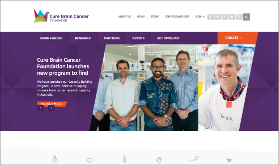
Comments:
- Several CTAs (on rotating main image), aimed at donors, but all indirect. “We have launched our Capacity Building Program…” is abstract jargon that requires the donor to figure out what it means for her.
- One fairly visible donate button.
- Images don’t tell clear stories.
- You: 0
Moceanic Donor Engagement Score: 20
International Relief Teams
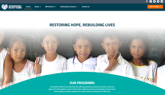
Comments:
- No clear CTAs just statements about the mission. Restoring hope and rebuilding lives are abstractions.
- One donate button in a contrasting color.
- The image is pleasing but doesn’t tell a clear story for the donor.
- The statement is not aimed at the donor.
- You: 0
Moceanic Donor Engagement Score: 20
Eastern Health
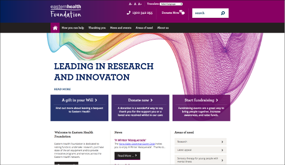
Comments:
- Several CTAs, some clearly aimed at donors, others not.
- Images range from highly abstract to emotional (on several rotating images).
- Several donate buttons, none in contrasting colors, so a bit hard to find.
- Most of the main statements are not about donors but about what the organization does.
- Like many medical charities, this one faces a challenge: Eastern Health is a hospital/health center, and the main website is dedicated to marketing its services — as it ought to be. The Foundation has this subsite within, which may be hard for people to find. The logo that emphasizes the word “Foundation” may be confusing many donors who perceive that they are donating to “Eastern Health” (see ‘Is your Foundation forcing donors to think twice before they give?’)
- You: 5 (!)
Moceanic Donor Engagement Score: 50
Save the Children – New Zealand
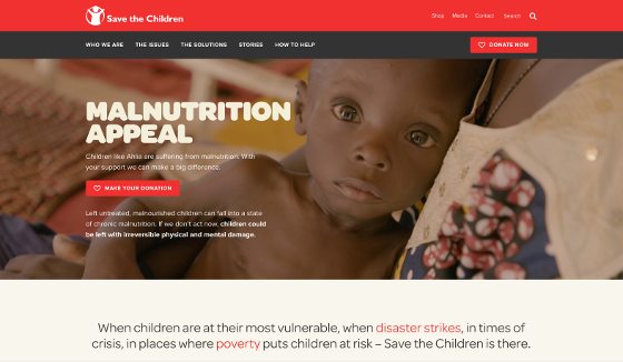
Comments:
- CTA is strong and donor-focused. The headline (“Malnutrition Appeal”) could be stronger — this is a bit abstract.)
- Two donate buttons, both fairly visible. They’d be easier to see if in a contrasting color.
- The large type at the bottom is a brag, could be more of a donor statement.
- Good photo that matches the content and tells the same story as the words — very unusual for home pages!
- You: 1
Moceanic Donor Engagement Score: 80
World Relief
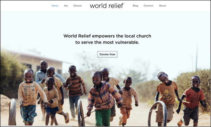
Comments:
- The only visible statement is a self-focused statement, and thick with jargon, not donor language. It’s a brag, not an invitation for donors to do something.
- Donate button is front and center.
- The image is pleasant and engaging, but it’s not clear what story it’s meant to tell.
- You: 0
Moceanic Donor Engagement Score: 25
World Vision
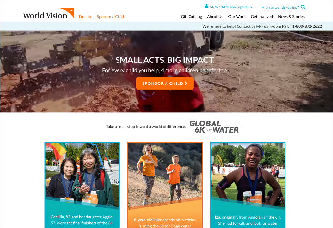
Comments:
- Many CTAs, all clearly aimed at various types of donors.
- Images are emotional and relevant (what you see here just happens to be an awkward moment from a video that was playing).
- Donate button very visible.
- This website is very dynamic, always featuring up-to-the-moment material. This day, it was about a donor run.
- You: 2
Moceanic Donor Engagement Score: 95
(It might deserve a perfect 100, but we want the team at World Vision to keep exploring ways to make it even better!)
If you want to get your website right for your donors, avoid some terrible mistakes, and save yourself a lot of time, Sean and I can help you with personalized one-to-one coaching. Click here to find out more.


